This slideshow requires JavaScript.
At the moment there doesn’t seem to be a solid identity, The colours dont seem to cross over on to the other bits of info graphics, The fonts aren’t coherent and the signs seems to be almost invisible they have nothing that makes them stand out as much to notice them, There are signs missing I would have no idea what to do if I was there and where and how to get there because the main attractions arn’t labelled and are not made to look like they are a fun attraction how can you plan on bringing in people and revenue when they cant see the reason to be there.

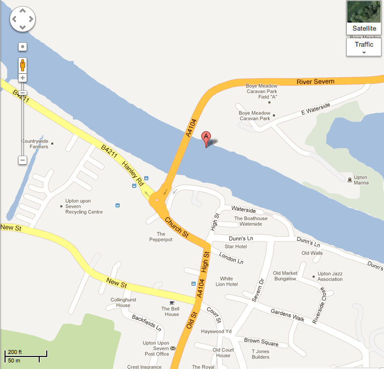
You can see there are two entrances which lead on to church street and then on to the high street the roads are really simple to see but when you walking around you have no idea how long you will be walking somewhere before you find it and there isn’t a left so you can find the river port/water side.