Archive for Information design

User testing results

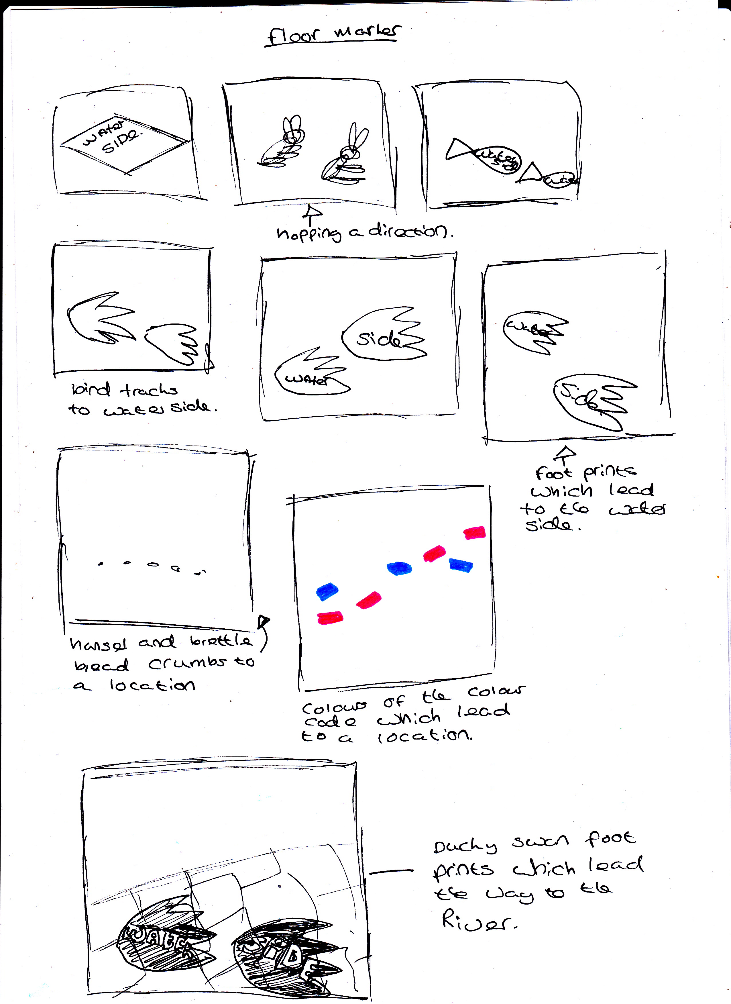
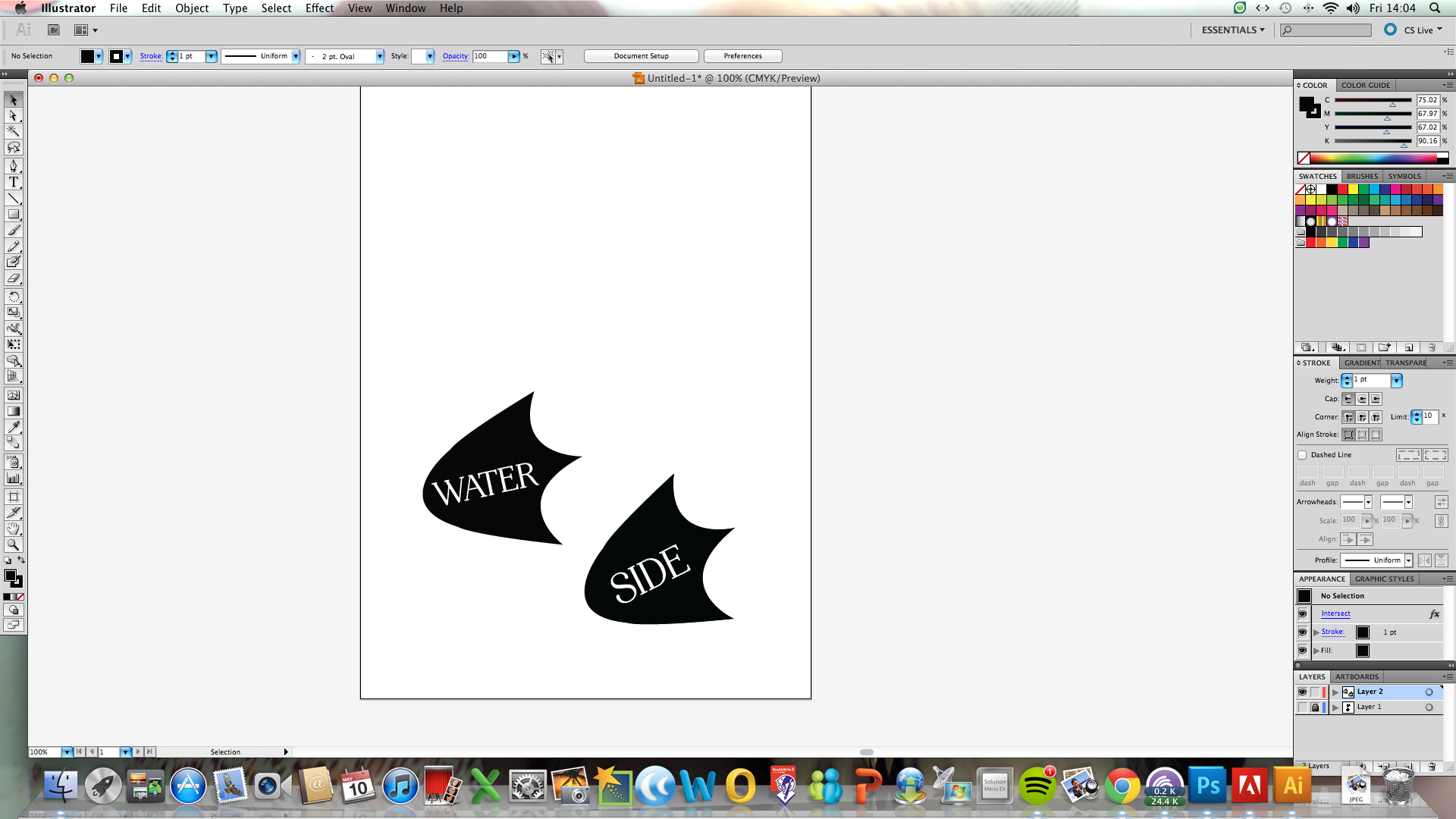
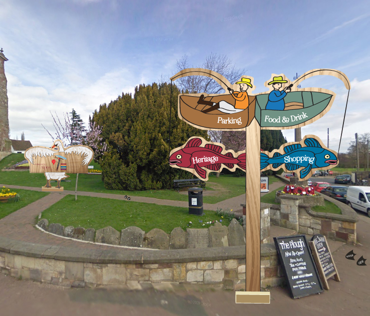
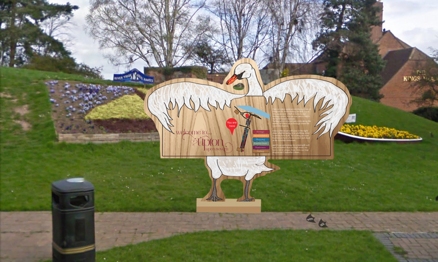
I wanted the results to be shown as close to the deadline as possible so that people could keep filling it in so i could get a more accurate result of what people think here are my results as it charges you to save your results I have just print screened the outcomes to show you.

Screen Shot 2013-05-13 at 12.30.11Screen Shot 2013-05-13 at 12.30.15Screen Shot 2013-05-13 at 12.30.19Screen Shot 2013-05-13 at 12.30.24Screen Shot 2013-05-13 at 12.30.28Screen Shot 2013-05-13 at 12.36.35Screen Shot 2013-05-13 at 12.36.44Screen Shot 2013-05-13 at 12.36.50Screen Shot 2013-05-13 at 12.36.54


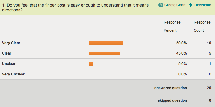
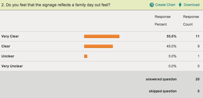
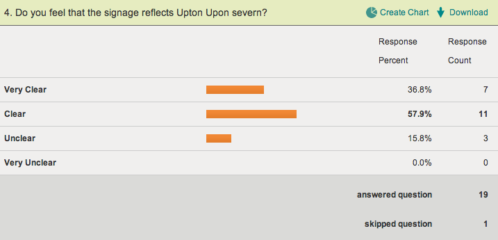
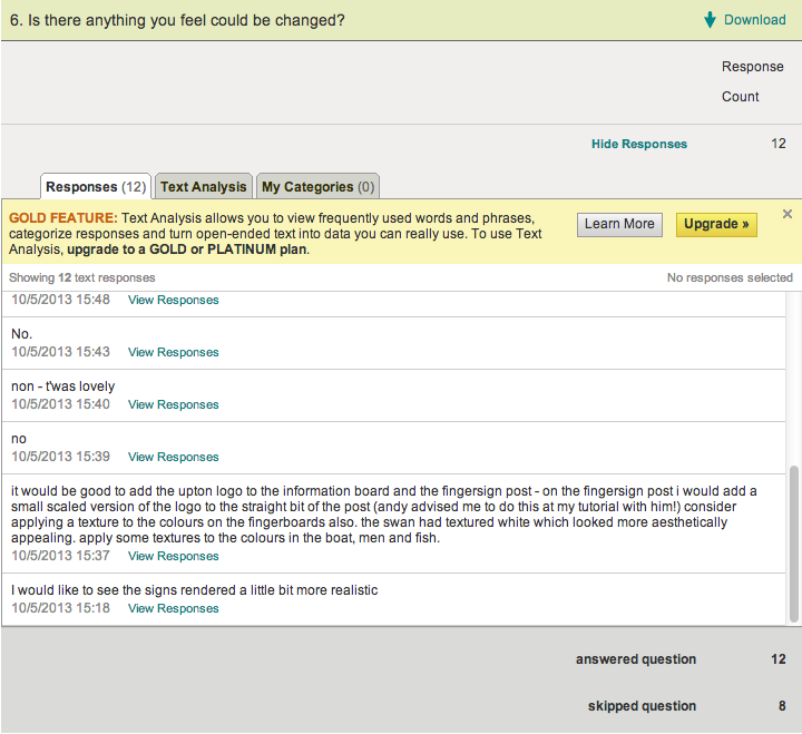
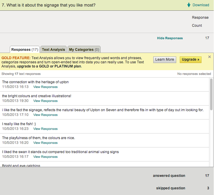
In the end twenty people took part in my user testing for my signage here are print screens of the results and what they said about my work.I found survey monkey a really good sight to create a survey and gather information.

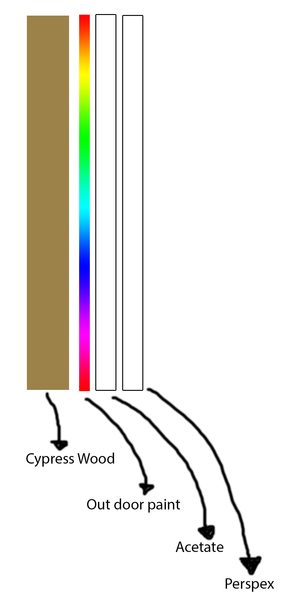
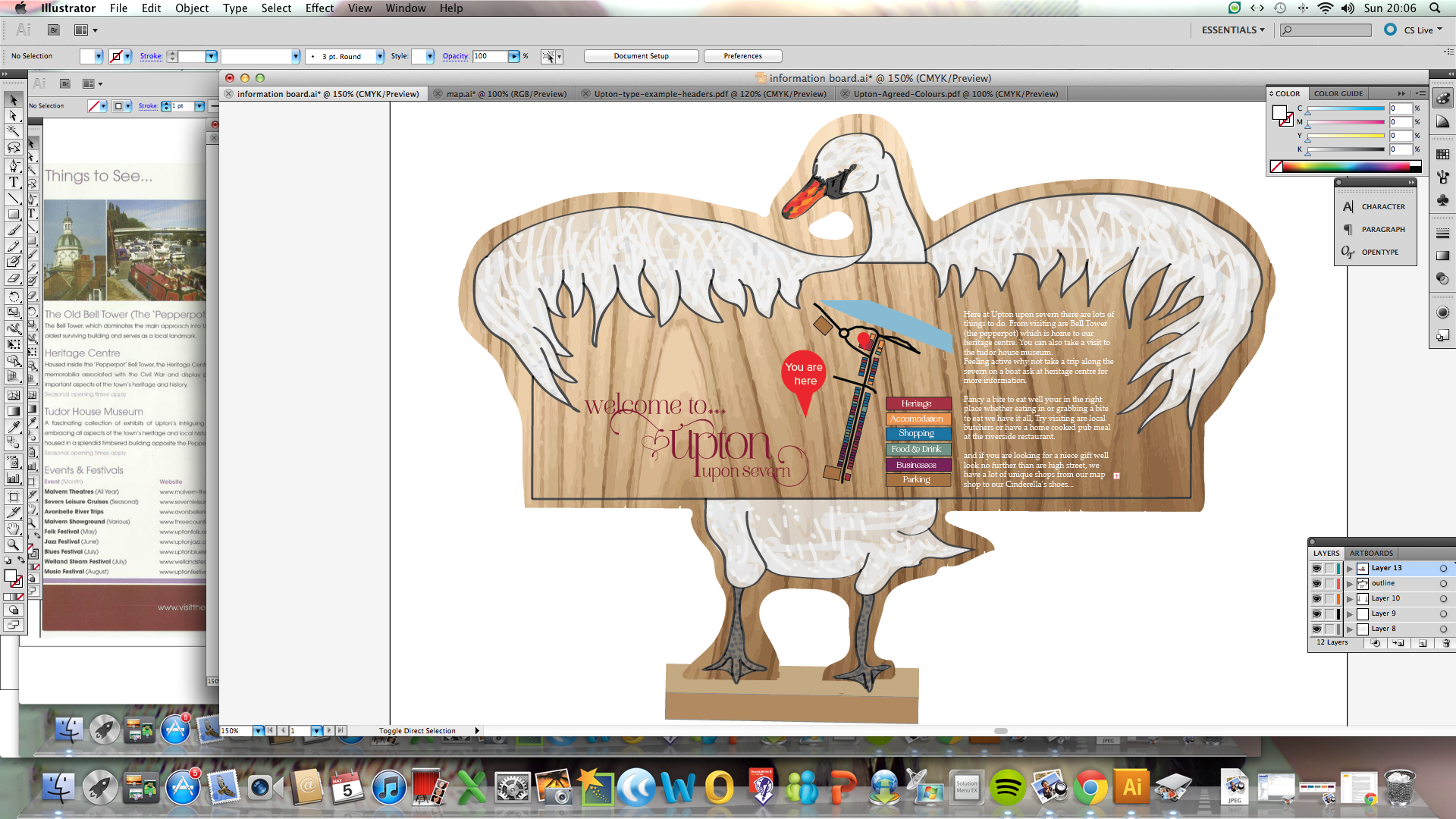
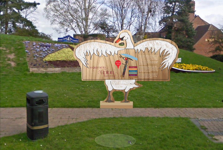
Here are my results over all it has informed me that people would like a larger image and that they would like to see the finals look more real but over all all the feedback was very positive.

Here is my survey for the upton signage

USER TESTING SURVEY!!!

I decided to make an online survey sending people the images they need to look at then the survey link and a short description explaining upton is a small riverside town with historic value 🙂

http://www.surveymonkey.com/s/5LN7H38

^^^ check out my survay

I felt this was a good device to make my user testing on as i couldnt cheat at it, it only lets one device at a time do the survey the only problem is for the analysis you have to pay you cant download so I will have to print screen the final results I get the day before so there the most accurate they can be in terms of people filling it in, the people I have got to fill it in are friends, family and local people to Worcester who I work with so they no the area so I can get an outsiders point of view as they would be the visitors and local peoples point of view.

information post text

info board

info board

Here at Upton upon severn there are lots of things to do. From visiting are Bell Tower (the pepperpot) which is home to our heritage centre. You can also take a visit to the tudor house museum.

Feeling active why not take a trip along the severn on a boat ask at heritage centre for more information.

Fancy a bite to eat well your in the right place whether eating in or grabbing a bite to eat we have it all, Try visiting are local butchers or have a home cooked pub meal at the riverside restaurant.

and if you are looking for a niece gift well look no further than are high street, we have a lot of unique shops from our map shop to our Cinderella’s shoes…

Enjoy your visit of upton Upon Severn.

Finals

This slideshow requires JavaScript.

My finals I have tried to create a fun and playful piece of signage, I have based it around the water side and the Idea if these were real signs they would be made out of Cypress wood as its good for a lasting life out side and wont begin to rot, the swan illustration and the fishermen and there fish would be painted on by hand in a outdoor paint then sealed with a varnish then there will be a screen on the front of perspex where the map and information will be in as information may change so it can be changed easily and the actual map will be printed on assisted so that its easily interchangeable and as its transparent you will be able to see the texture of the wood from beneath.

I wanted to create something for a family audience as if you can bring families into Upton then your bringing a set of people at one time rather than the one person plus families will spend a lot weather that be on lunch of presents for there children.

I wanted to make something children would want to read as-well as adults and make reading and finding there way fun.

also the finger post will measure 8.5 foot tall so its just above eye level but not to high that its hard to read.

the information board will measure 7 ft so that the information is around eye level as the neck of the swan makes it a little taller.

the foot markers are 12 inchs by twelve inches that applys to the seperate feet not the two combined so that its readable from above but not distracting for people walking about.

materials


Here i have drawn you a quick info graphic to show that the layers consist of wood then out door paint on the wood then information printed on acetate then perspex on the out side as its waterproof and weather resistant. 

3I started out with simple shaped showing the direction with arrows and thinking about the way the sign comes into place with the post.

14The use of antique hands to show pointing I initially thought was a really good idea I wanted to portray the vintage quirkiness of Upton

15I began to look more into depth with combining shape and the way that I would present my actual sign rather than imagining it with the post.

14I decided that I liked the Finger pointing best and felt that was the idea that worked the best for my work.IMG_0008I then saw some other peoples Ideas and saw that they had also done something similar with the finger pointing to the direction and it made me re think things and try and create something a bit more unique to the obvious and move away from that.

IMG_0011IMG_0010I thought about when I looked into the animals of Upton and how when we went on the trip they were the thing that I remembered most was the ducks and swans at the riverside and thought about how back home I take my sister out for lunch and to feed the ducks at local ellsmere lake.

6I started thinking about how I could incorporate an activity such as fishing and how it could come together playfully.

8

I also thought about the family animal theme and having different animals pointing in different directions but in felt this wasn’t quite right but i did like the fish on the post.

2IMG_0009

Then I began thinking about the map maybe making it into a wavey river and having a duck float on top.11Then some more traditional information board layouts but again I felt this looked a bit to close to other peoples work and I didnt want to do that I wanted to crea\te something different with a hand made feel.

10This idea I really really liked I needed to develop it more by drawing an actual swan and combining it.9

This was one idea I had for the finger post but i felt that it couldnt be colour coded which would take away from my over all signage.1 4here is my drawing for the information board the plan was to add my map in later and move it around so to see how it fit best with information i felt was vital for visitors.

512 13here are my colour codings for my map i drew out my street and then went on google maps and followed the highstreet down colouring in shops and lableing what they are as i went on.

mapI then created this on google maps using the path tool and the rectangle shape tool I counted the buildings from the plan i had just made then I changed the colour of the individual boxes after originally I was going to not outline the buildings I felt it worked better but it meant that the buildings merged and it became confusing so i put a black outer line around them I added a new brown colour to the colour coding for parking and then added a you are here icon to the map so people no where they are in terms of the high street.

IMG_0011 Screen Shot 2013-05-05 at 14.47.41 Screen Shot 2013-05-05 at 14.58.24 Screen Shot 2013-05-05 at 17.00.15 Screen Shot 2013-05-05 at 19.40.08 Screen Shot 2013-05-05 at 19.40.40 Screen Shot 2013-05-05 at 19.42.07 Screen Shot 2013-05-05 at 20.03.55 Screen Shot 2013-05-05 at 20.06.30here is my development on illustrator the colouring in the drawing and the moving the components around to get the best use of the landscape space as i could.

Screen Shot 2013-05-05 at 20.19.54here is my information board living in its setting where I feel is most apropriat.5Here I have developed a finger post which I feel works pretty well the different components will be colour coded and its shows an activity you can do whilst being in Upton.Screen Shot 2013-05-06 at 10.57.11I scanned in my drawing then using illustrator drew a new layer using the paint brush tool then created a new layer again and coloured it in using the paint brush took I did this to the whole thing then added in a wood effect vector and deleted the parts I didnt want and moved the layer behind my illustration.Screen Shot 2013-05-06 at 12.03.01finger postIMGThese are my ideas for the floor markers I ended up with the idea of there being foot prints from the swan to the waterside as its a key attraction and its the only thing that isnt colour coded on my map.

Screen Shot 2013-05-10 at 14.04.38 Screen Shot 2013-05-10 at 13.55.30I drew out some duck/swan print shapes using the path tool then added in the words water and side the used the pathfinder tool to make it so the words were subtracted but later I felt this didnt work and would be better the black and white contrast.

finger post in setting copiaI inserted my signage into the areas I felt apropriat and tried to possition them so they could look as realistic as possible.

info board in settinghere is my other information board its positioned close to where the info board which is currently there ageists I felt this was the right place but I thought the information needed to catch peoples eyes that are walking past the pepper pot not just be in place for people that are going there already.

Animals of upton

I have decided I want to keep with the vintage theme, but also I feel as though I want to incorperate animals of the local area into the signage to make something which stands out and has something about it which can remind people they are home but also show tourists that upton is a nice place with things to look at and I think including animals will make a more interesting design.

This slideshow requires JavaScript.

The upton leaflet with information that tourists at the moment have access to.

This leaflet gives me an insight on what there is already to see in upton and what the people like I think I need to look at what they want to show people before I start showing people.Publication4Publication3Publication1

Vintage signage

I have learnt that with it being such a small town that it needs to have aspects of the vintage feel here are some examples of vintage signage and I want to look at the shapes in these designs and incorporate them into my own design.

This slideshow requires JavaScript.

This slideshow requires JavaScript.

Here is a leaflet I got from upton upon seven which has details of all the things that are going on there and what tourists…..

signs

Alexandre Delmar

This sign I feel could work for somewhere like upton the hand crafted kind of look is something I feel can really work.

3

I really love this piece of signage but I dont feel this will work I think the signage needs to be a lot more simple.

4

This I think would work really well in a kind or merge to a vintage way i really like the 3d look and i feel it could be a firm compromise between old and new.

5

6

7

8

9

10

11

12

« Previous entries